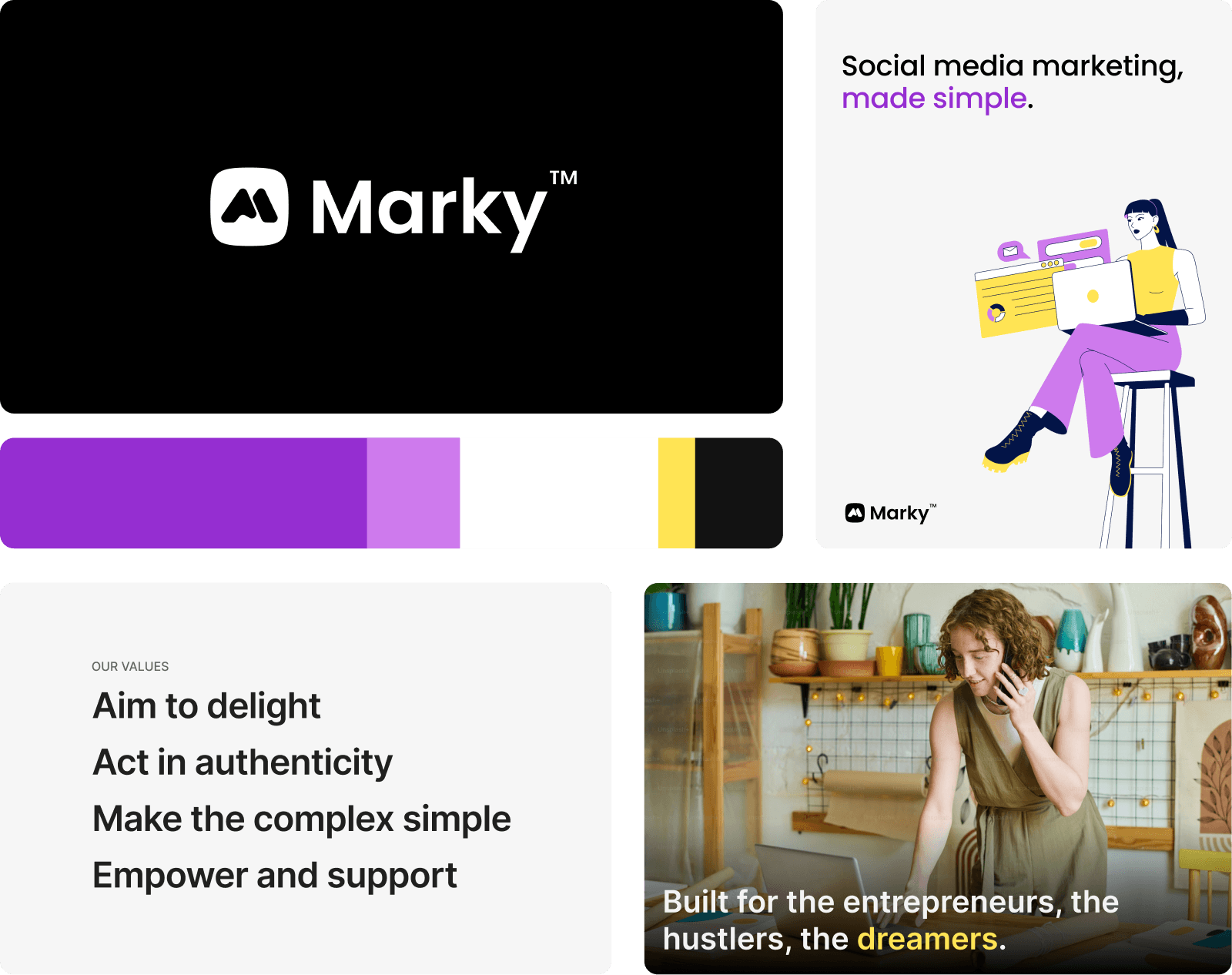
Marky
Product Strategy / Design / Engineering
overview
Small businesses face tough calls when it comes to marketing. Hiring an agency costs thousands a month. Doing it yourself takes hours a week. Marky was founded to give them a third option. What started as 'training an AI to write your social posts' evolved into something deeper — a platform that learns how each unique business wants to present themselves and reduces friction at every step. This case study is about how we got there: research, iteration, and a few hard calls along the way.
Timeline
2023 – Present
Role
Co-Founder, Head of Product
Tools
Figma, React, FastAPI, Claude Code
from 0 to 1
Marky is an AI-powered platform that helps small businesses across the entire social media workflow. It generates on-brand posts and schedules them directly to platforms like Instagram, Facebook, and LinkedIn. For most small businesses, consistent marketing is the difference between growing and staying invisible — but it's also one of the first things that falls off the plate. The time it takes to plan, write, design, and post adds up fast, and hiring an agency ($2–5K/month) isn't realistic for a business running lean. Marky lets them multiply their marketing efforts, reducing that costly burden into 5 focused minutes.
From meetup idea to product
My brother and I founded Marky in 2023. He led the business side, and I led the product. The idea started at an AI meetup where he met someone who helped book authors. Authors would spend years writing a novel, but on launch, their books wouldn't sell. Nobody would buy it because nobody knew about it. We designed Marky to help them get the word out on social media.
Validating demand before writing code
Our earliest stages were focused on understanding the problem. We operated concierge-style — hopping on calls with users, delivering the solution by hand. The first "product" was a hacked-together Google Sheets + workflow automation tool, with us working with customers and setting up accounts directly. This enabled us to rapidly explore, iterate on methods, and validate willingness to pay before building anything.
Designing a brand for a broader market
As more businesses outside of publishing showed interest, we naturally grew to support a wider range of small businesses. With a broader market came the need for a real brand. I designed ours around a simple mission: help small businesses reach their audience.
growing the product
Reframing what we were actually building
I led our development team of 5, owning research, design, and strategy. With our growing customer base, we needed to build a better vision for what we were actually building.
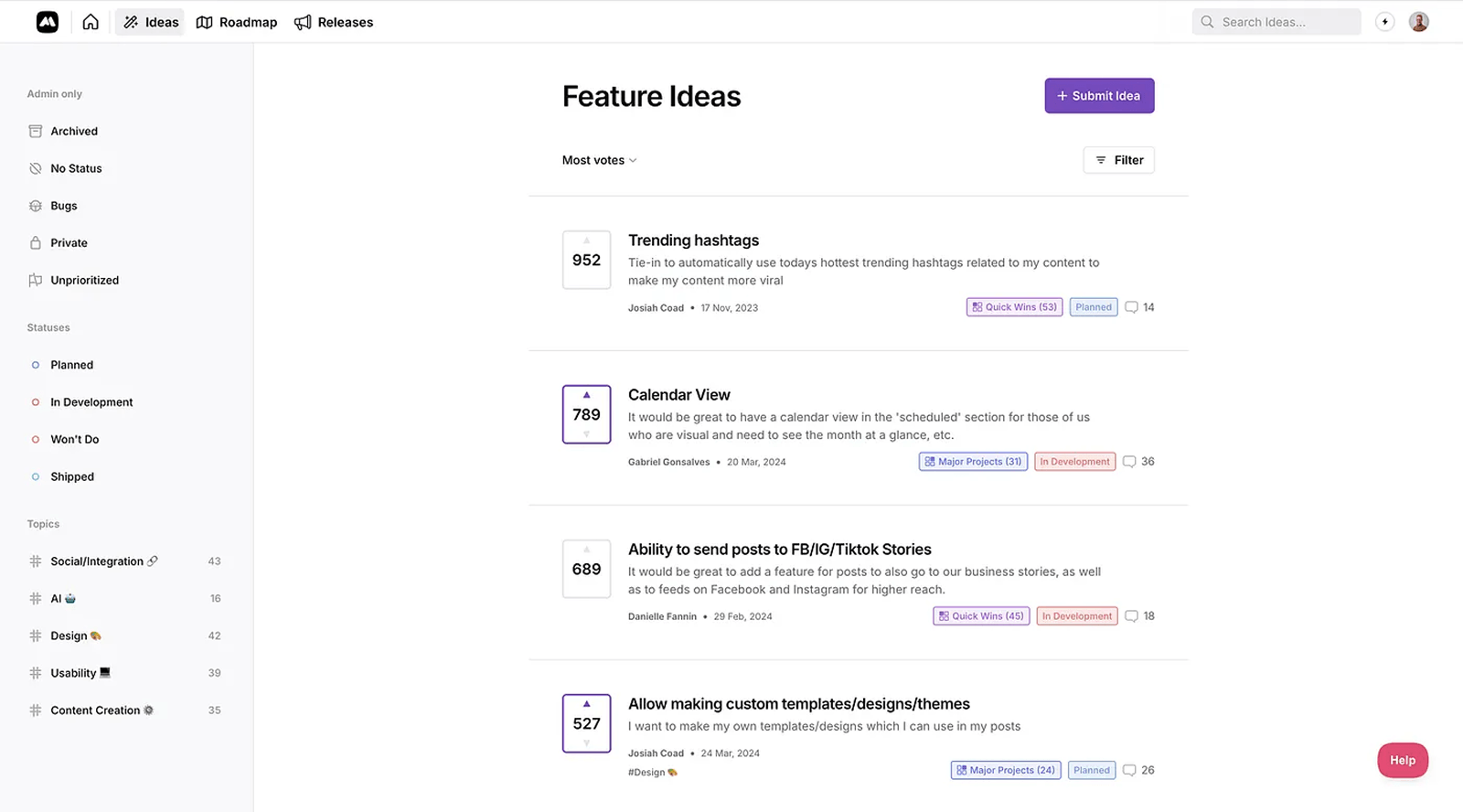
Using a combination of user interviews, a feature request board, and in-product data, I was better able to understand the problem we were solving. We couldn't just "create content" — the real problem was helping customers grow their business through social media.
For example, one finding was that users whose posts included real images from their own business outperformed those using stock imagery. That led us to automatically pull images from customers' websites on signup so every post felt specific to the business from the start. I also started a YouTube series, led our customer support team, and created social media education resources.
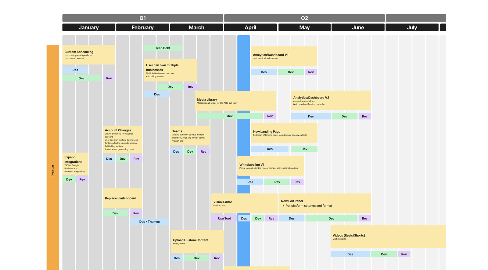
Product roadmap for 2025 Q1
Rejection rate as a decision-making lens
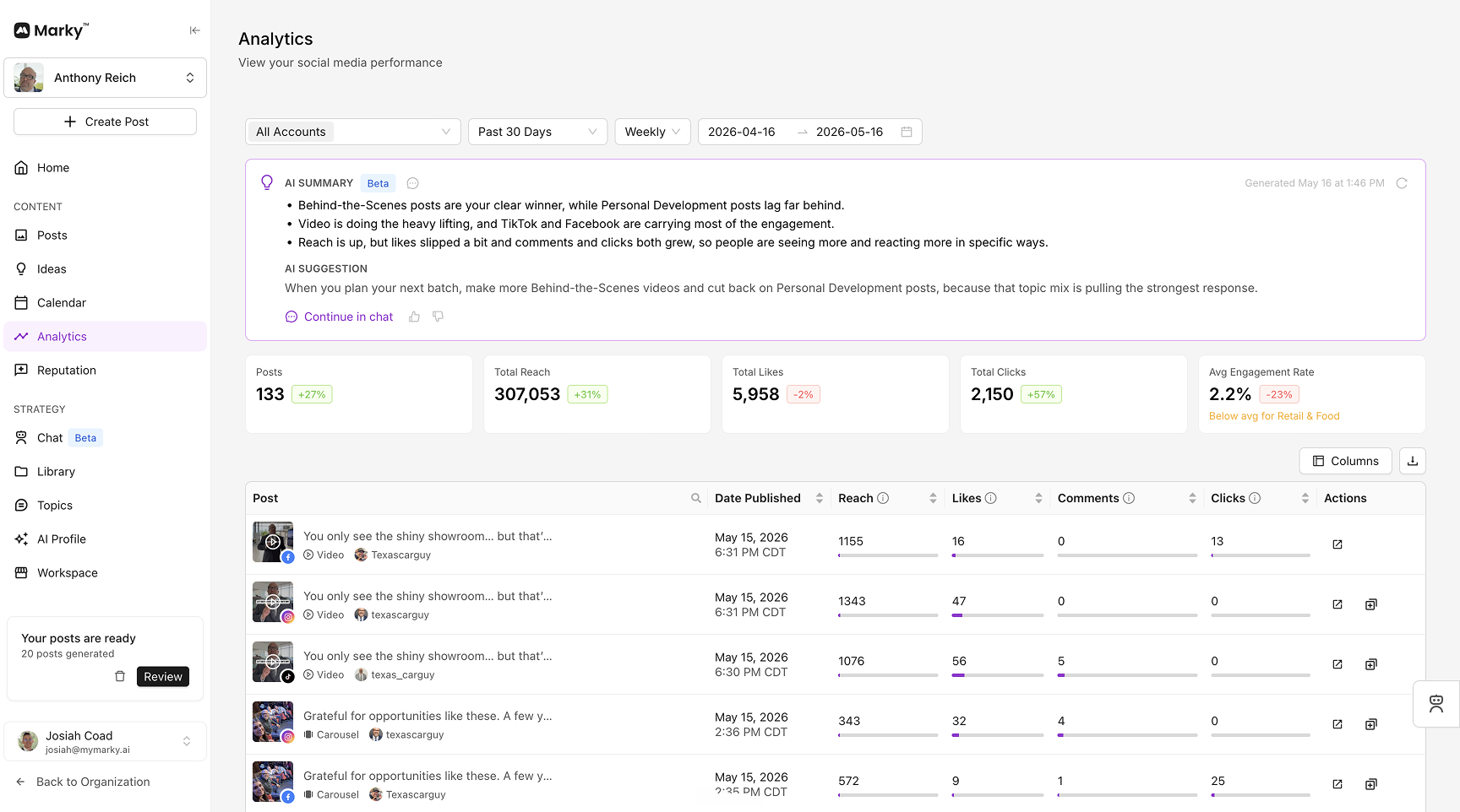
Post rejection rate was one of our North Star metrics — the most direct measure of whether Marky was producing the content users wanted (Doerr's Measure What Matters). To improve it, we tracked what users edited — whether they changed the design, the caption, swapped out a photo, and similar changes. We paired this with qualitative feedback using the occasional survey that asked users why they rejected a post. Every improvement shipped as an A/B experiment so we could validate impact before rolling it out fully.
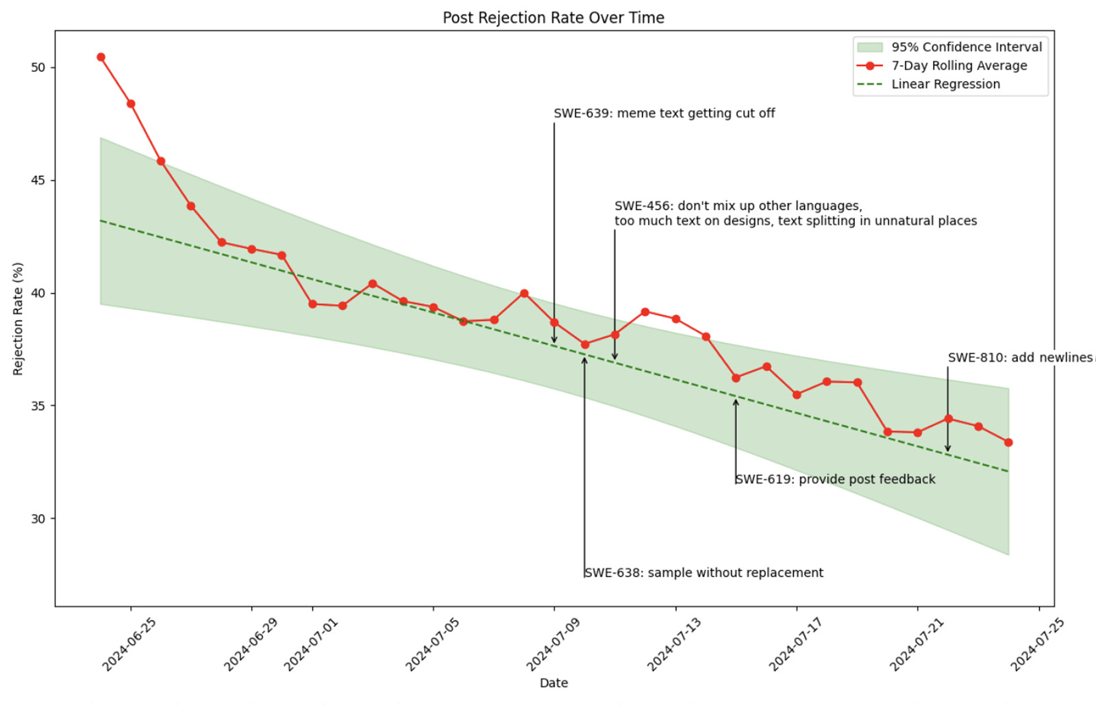
Killing a feature to build better process
One difficult call was after we built an experimental chat-based interface and shipped it publicly. Many users reported using ChatGPT in conjunction with our app, so this felt like a sure win. Some users loved it, but others were frustrated due to unmet expectations. Rather than force it on everyone, I pulled the feature back and restructured our beta program — making experimental features opt-in instead. Every experimental feature after that shipped through the program, which gave us real feedback without risking the core experience.
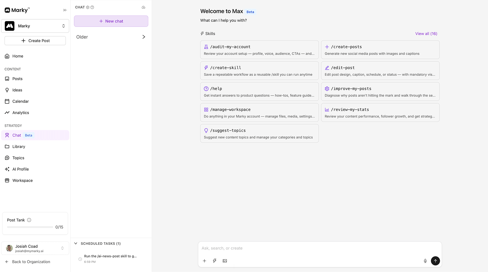
V1 — experimental chat-based generation interface
design deep dives
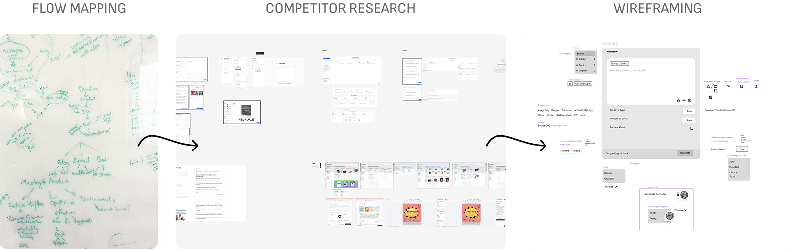
Our team shrank and I took on full-stack engineering in addition to product design. The tighter constraints ended up helping us reconsider what's important, and we cut meetings and processes that had been slowing us down. I picked up coding using AI-augmented workflows, and this period produced some of the strongest product work.
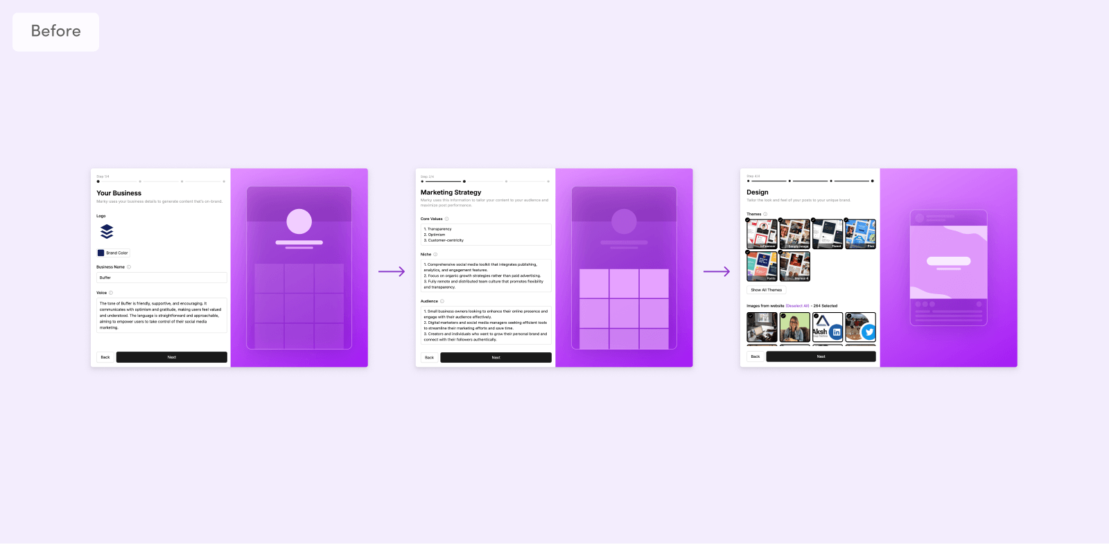
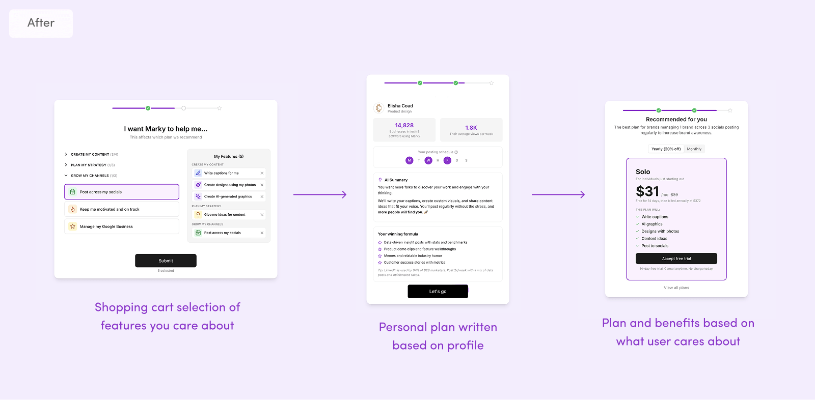
Why onboarding was quietly failing
The old onboarding was quietly failing. An audit revealed the numbers: the flow took ~10 minutes to complete and our first-batch post save rate was just 33%. We got feedback that while we auto-filled everything from their account, onboarding felt intimidating and first posts weren't hitting the mark.
~10 min
Old flow completion time
33%
First-batch save rate
Duolingo-inspired redesign principles
So I redesigned the flow around this principle: every screen should be self-evident (Don't Make Me Think). One decision per screen, easy-to-click buttons in consistent positions, and a focus on a rewarding, easy experience inspired by Duolingo's onboarding. Copy was carefully crafted, each question explains why it matters, and the next step was always clear.
V1 — auto-filled everything from their account, felt intimidating and overwhelming
What the redesign changed
Our new onboarding helped detect industry differences early — reducing steps and personalizing the product experience from the first session. We even chose a recommended pricing plan and highlighted benefits based on what the user cared about. The results: viewed posts rate jumped from 17% to 68%, post save rate climbed from 33% to 50%, and time to first post dropped from ~10 minutes to ~3 minutes.
A discoverability problem hiding in plain sight
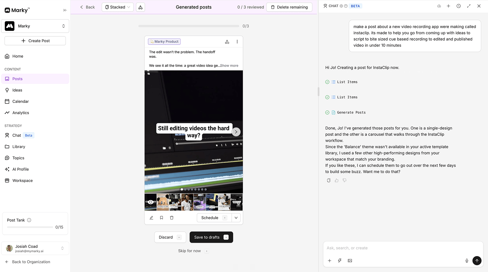
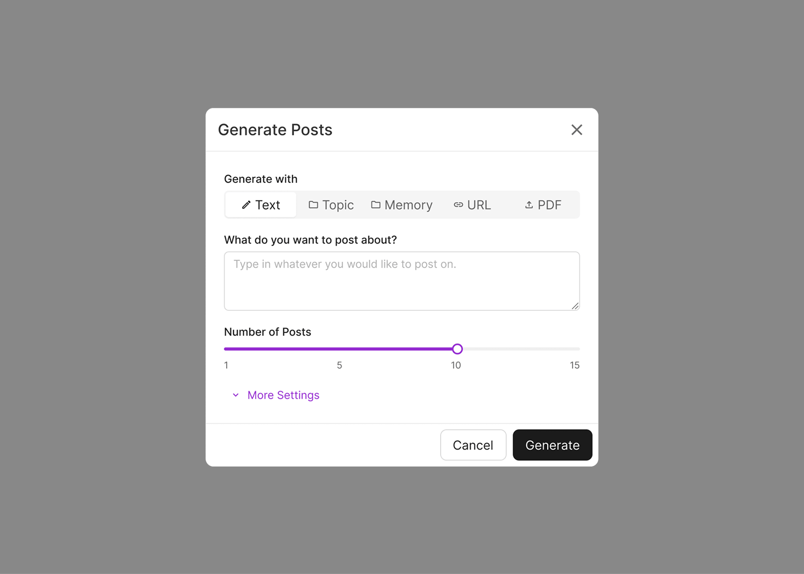
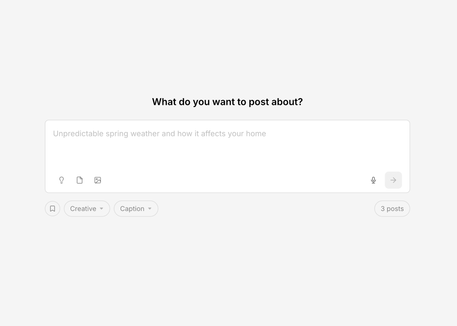
One challenging problem: how do we get users the post they want? Sometimes they start a session without a goal, but other times they have something specific in mind. The "Generate from description" flow was our solution, but it took a few iterations to get things right.
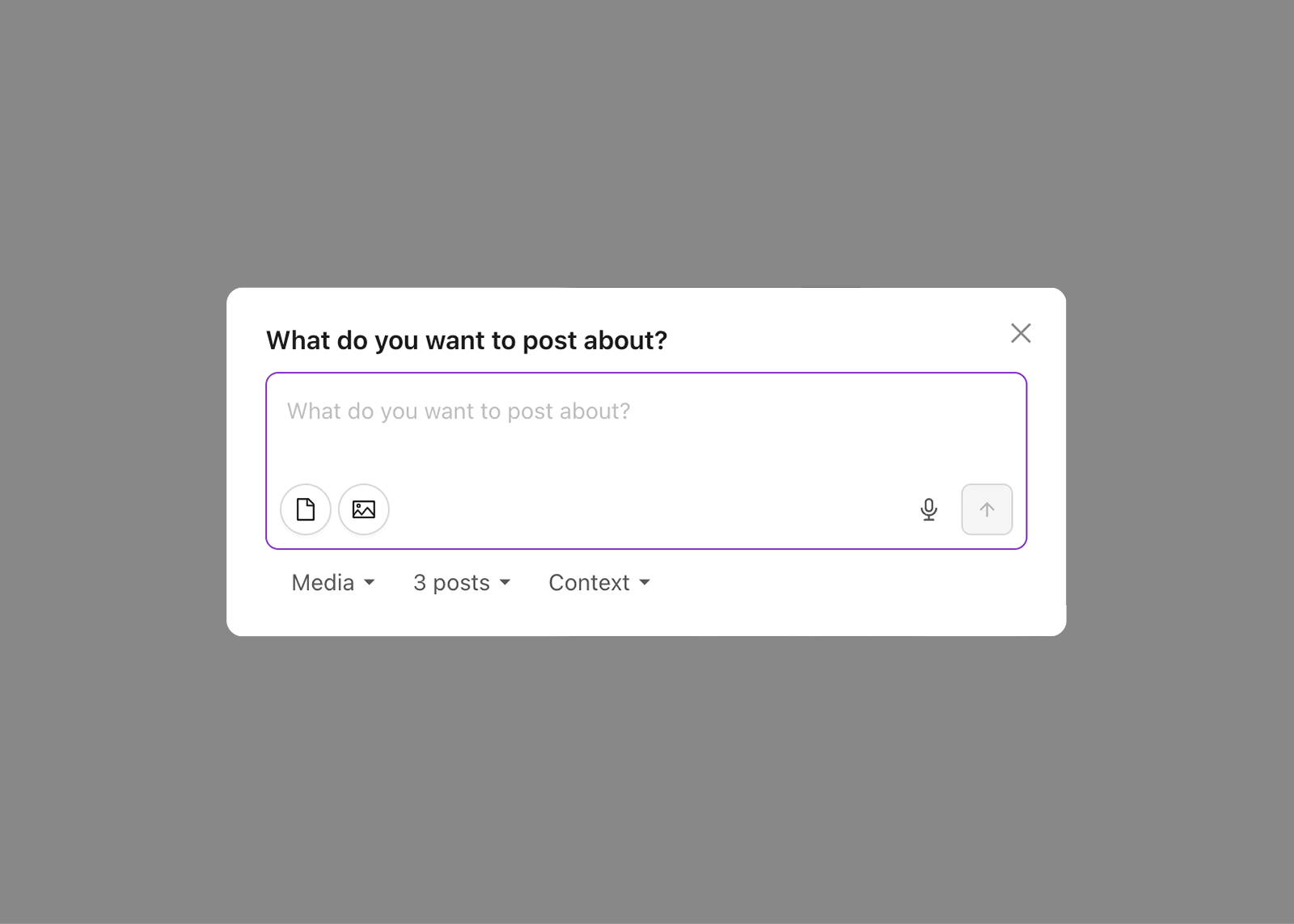
In V1, the feature lived behind a separate options menu icon, detached from the generate button. In user interviews, people would describe a problem this feature already solved — they had no idea it existed. I moved it to a dropdown arrow integrated into the generate button itself, and usage jumped from 6% to 20% of all generated posts, with 67% of active businesses using it at least once. But we overcorrected on simplification — feedback revealed that certain features became too buried. V3 found a balance: effortless core flow with easily accessible advanced features.
V1 — flat hierarchy and too many options upfront
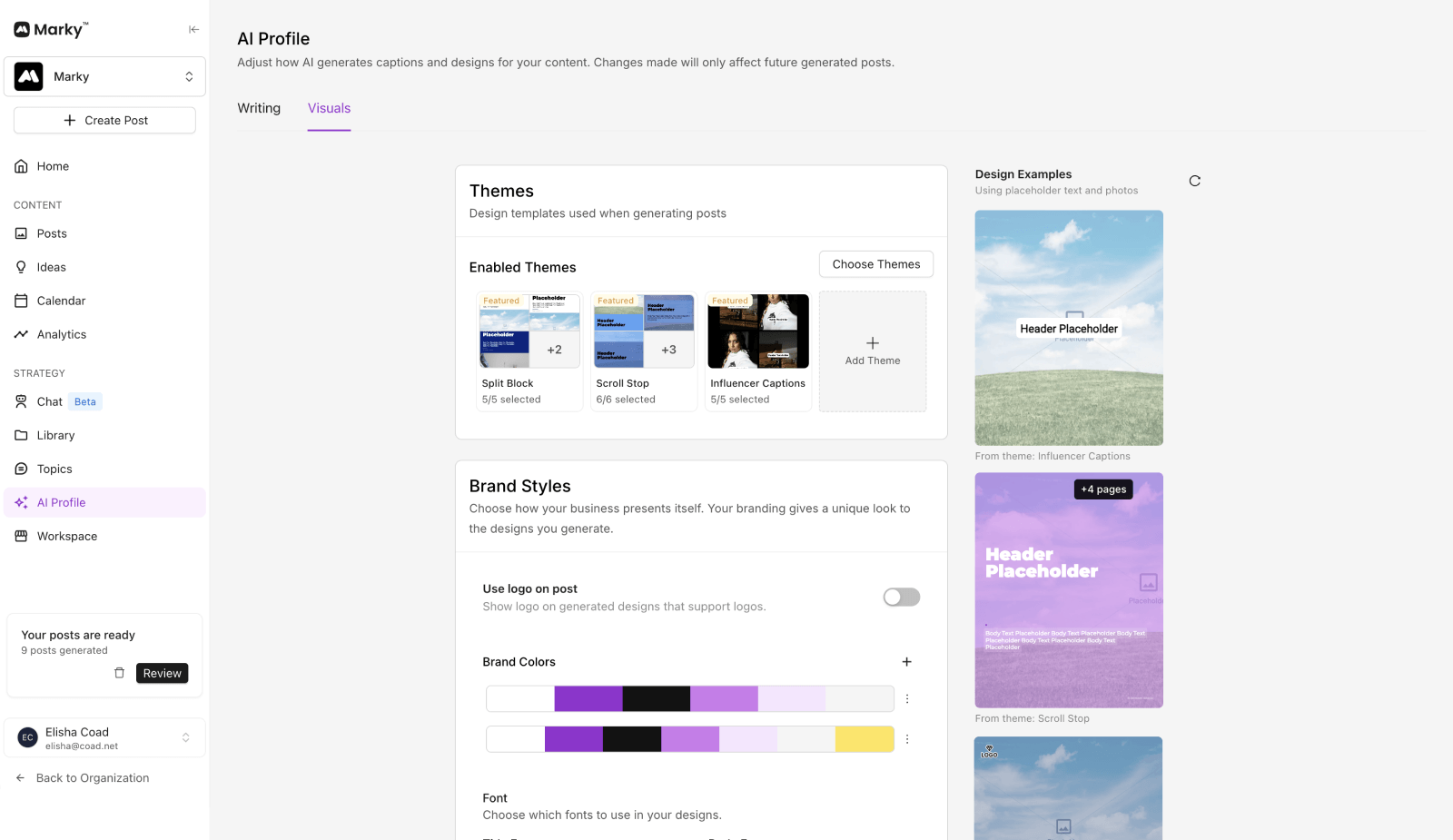
Building a product that learns you
There are a lot of factors that affect the posts for a user — design preferences, brand styles, user voice, and topic strategy. We do a lot to deeply understand their business and build a social strategy around it, but this means a lot of data. The issue: most users didn't know what to adjust to get the results they were looking for.
The first step was consolidation, bringing spread out settings all into one place. When you adjust a setting, you immediately see how it changes the output for instant feedback. This connection between input and result helped users better understand how their efforts affected the results.
But even with better discoverability, we realized some users just never left the core flow. When they'd only have 5 minutes a week in product, they didn't want to dig through settings. They'd get poor results and churn, even though just a few tweaks could dramatically improve their content.
From settings to signals
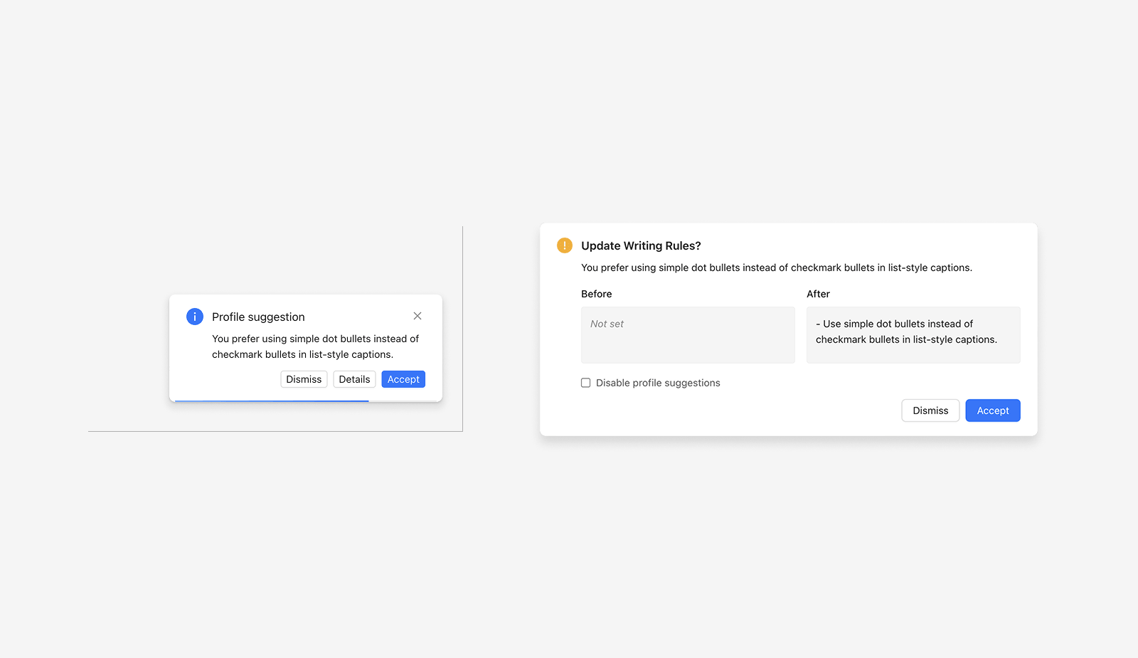
We needed a solution that allowed users to use the product how they want, without asking too much from them. After some drafts, I created an auto-learning system. Marky analyzes your caption edits and detects patterns in the background — always removing hashtags, adding paragraph breaks, cutting CTAs. When a pattern emerges, it automatically updates the settings. This is what Nir Eyal calls the "investment" phase in Hooked — every edit the user makes puts something back into the product that makes the next experience better. The product gets more personalized just by using it.
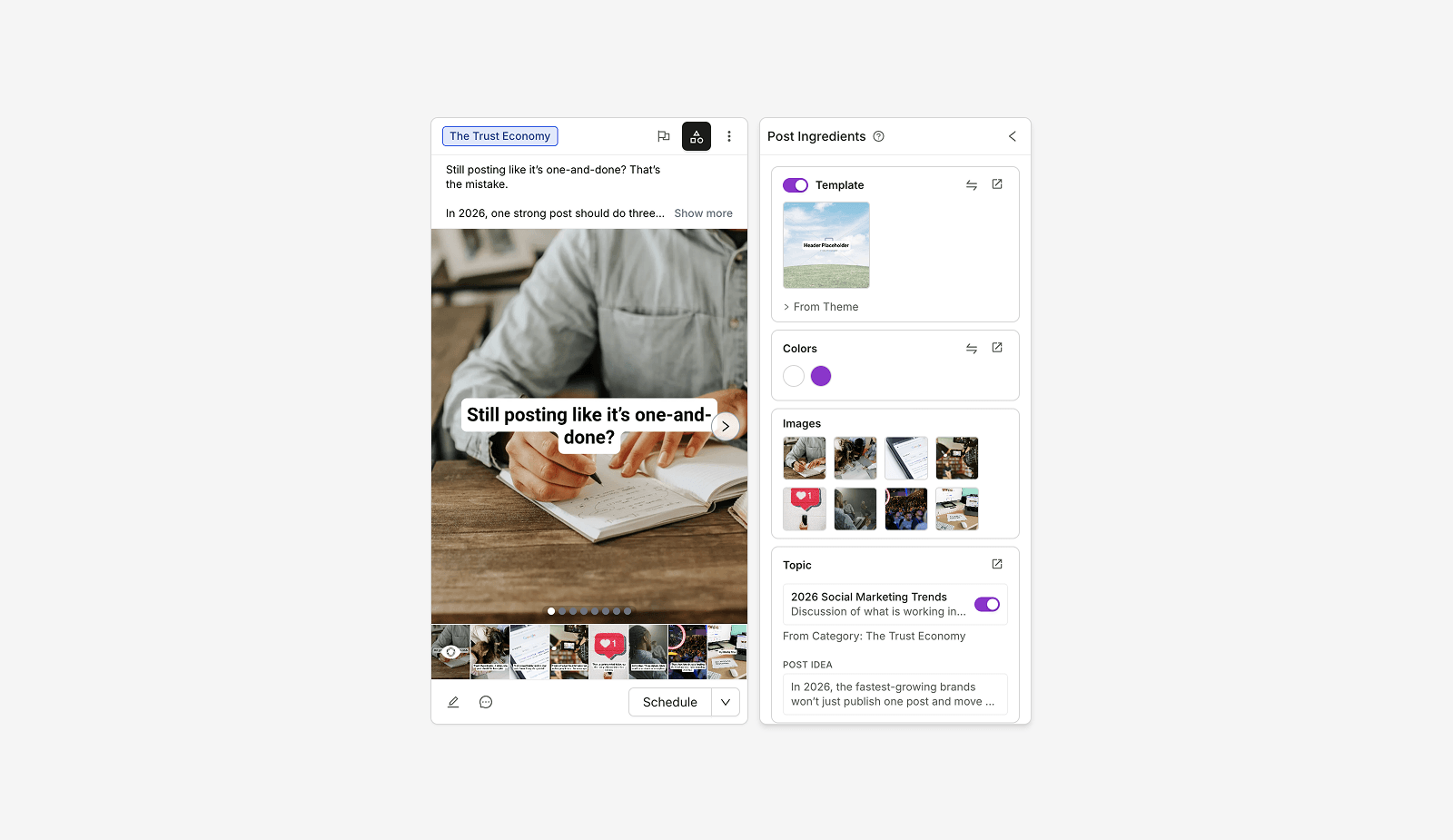
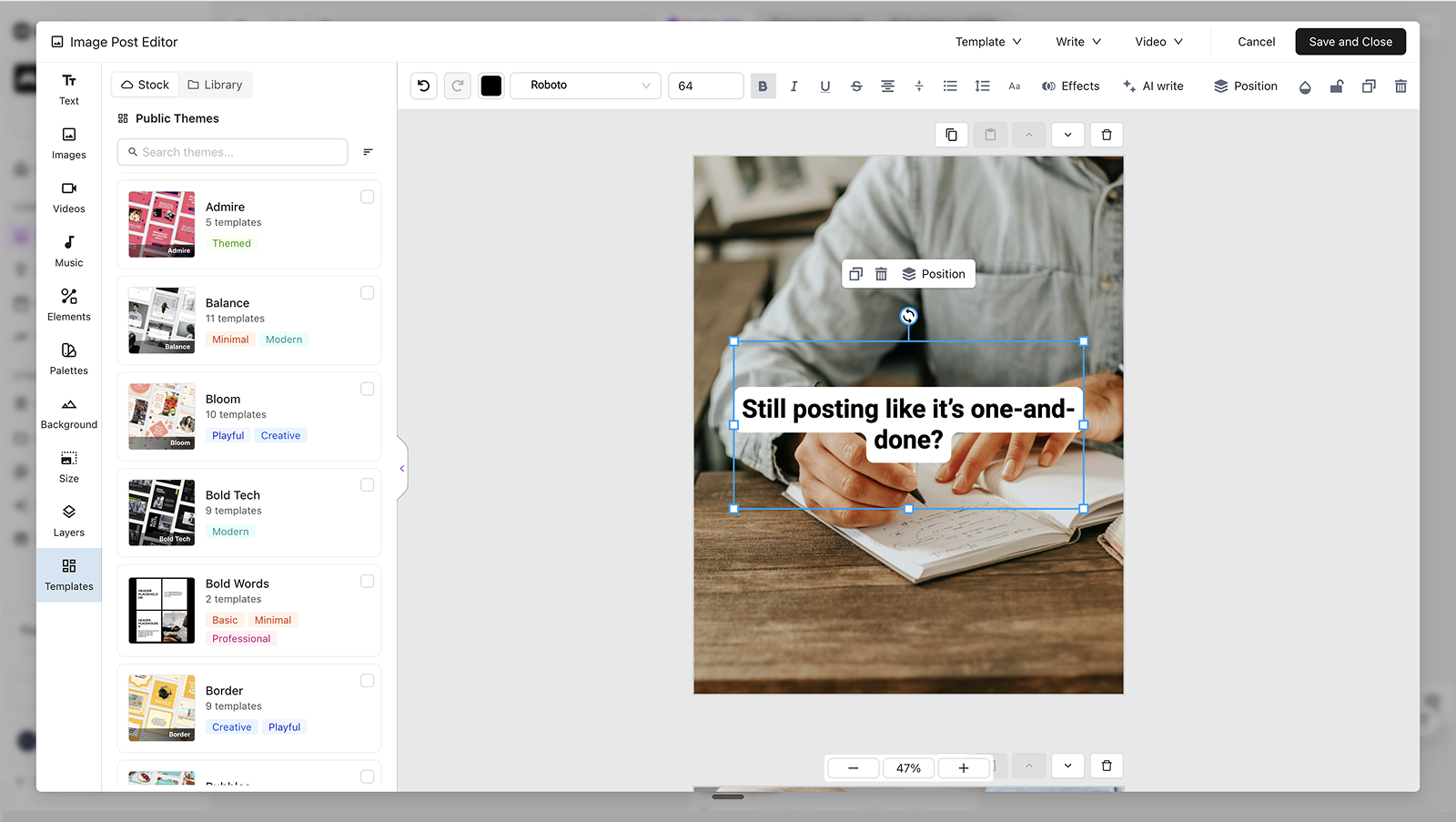
Consolidated settings — generation controls in one place with live previews
This shifted the product from "you need to learn the product" to "the product learns you." The AI doesn't fight the owner's judgment, it adapts to it.
impact
What started as a Google Sheet and a few authors grew into a platform serving 168k businesses. I'm grateful for the opportunity to build Marky with such a great team and it's been rewarding to see the impact it's had on our customers.
168k+
Businesses served
5.4M+
Posts published
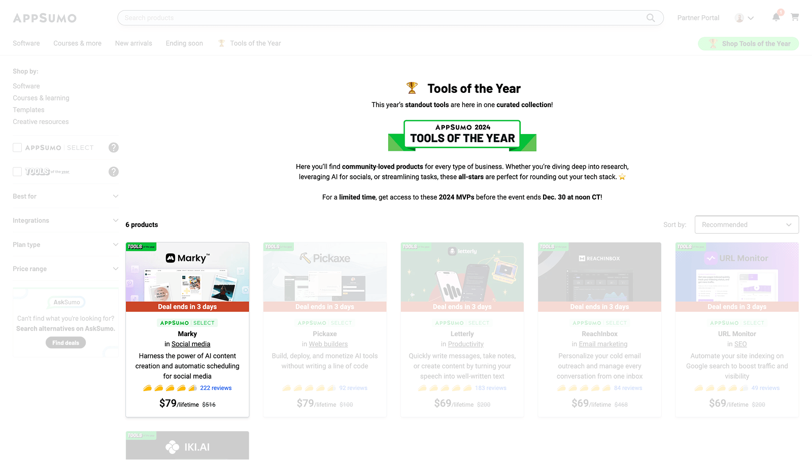
Top 2%
All-time AppSumo products
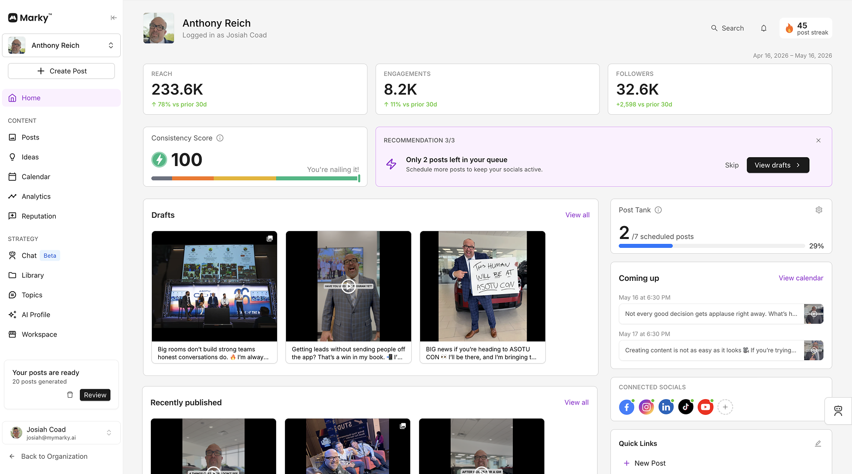
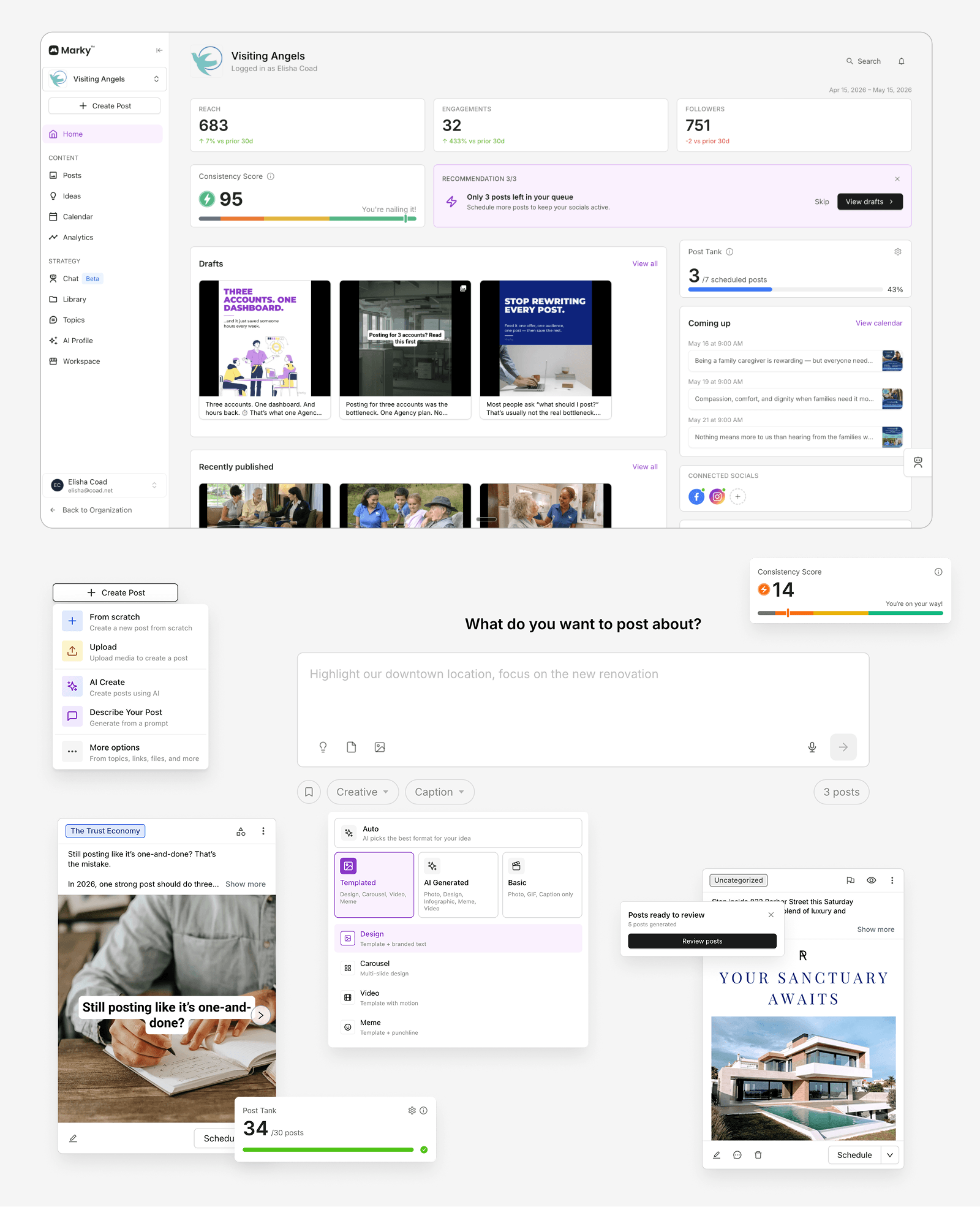
Home — personalized dashboard with quick actions and recent activity
What customers say
Here's a few things our customers have said:
There are plenty of solutions out there, most of them with AI, but what really makes Marky different is the commitment, the founders, the communication, how serious they take it to really improve on a daily basis. They make the customer's pains their own pain. I really love how the platform has evolved.
Sergio Rey, Marky Customer
It doesn't try to replace your voice or turn your business into something it isn't. It simply makes the things you're already trying to do easier and more consistent.
JB Floyd, Business Owner
It took about 5 minutes to get a month's worth of very high quality posts. I guess I will be using social media after all. Honestly, so grateful for this product.
Beccy Matthews, Author
Marky is hands down the best social content tool of 2024! The only one that truly delivers — highly recommended!
Martin Andrew L., CEO, Media Marketing & Advertising
takeaways
AI is changing how I design
There's always been a gap between a mockup and the code. What the designer sees and what the user sees. What the designer thinks it will feel like and what it actually feels like. AI workflows and a bit of code knowledge have opened up a new lane for designers. Now we can iterate on real interactions instead of simulated ones and get feedback from users on real experiences instead of imagined ones. When execution is no longer the bottleneck, knowing what to build and why matters more than ever.
Great product isn't enough
One humbling realization is how the product is just one aspect of a successful business. Ads, the marketing funnel, and customer success played just as important a role in Marky's growth as the product itself.
Less process, more velocity
Too many meetings and too much process nearly killed our velocity. Replacing detailed handoff docs and obligatory meetings with continuous conversation (Lean UX principle) was one of the best decisions we made.