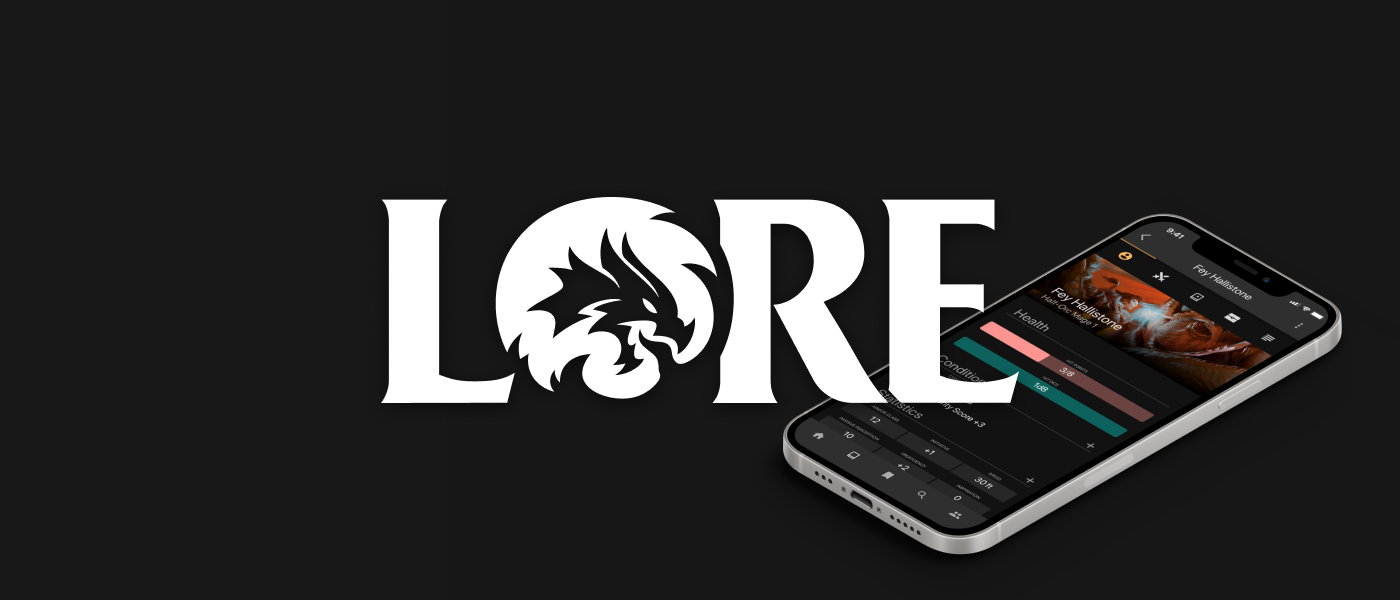
Dungeons & Dragons (D&D) is a popular tabletop role-playing game where players take on unique characters and build stories in their own rich fantasy worlds. In 2017, D&D Beyond was launched for web which provided D&D players additional tools to use for their games. Shortly after, a mobile version of this platform was released. Unfortunately though, the app wasn't well received due to poor design and user experience. Lore is reimagining of that app, but puts the player's needs first. Please note: this work is speculative
1 month, 2020
UX/UI Designer
Adobe XD, Illustrator, Photoshop
To start this project, I familiarized myself with the original D&D app and spent some time exploring the needs and wants of current D&D players.
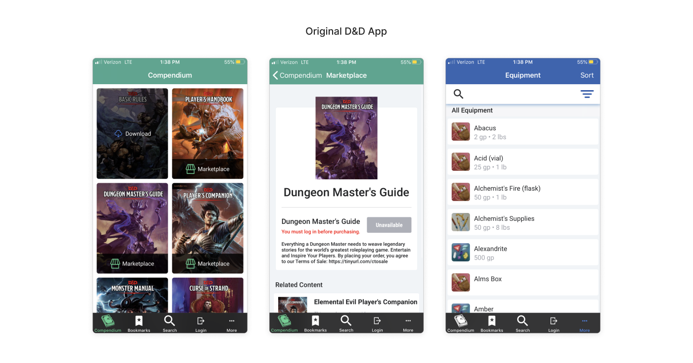
I already had some familiarity with the D&D Beyond app and chose it to redesign it due to a clunky UX, poor app reviews, and an overall generic design. I reinstalled the app and did a deep dive into its current features and interface.
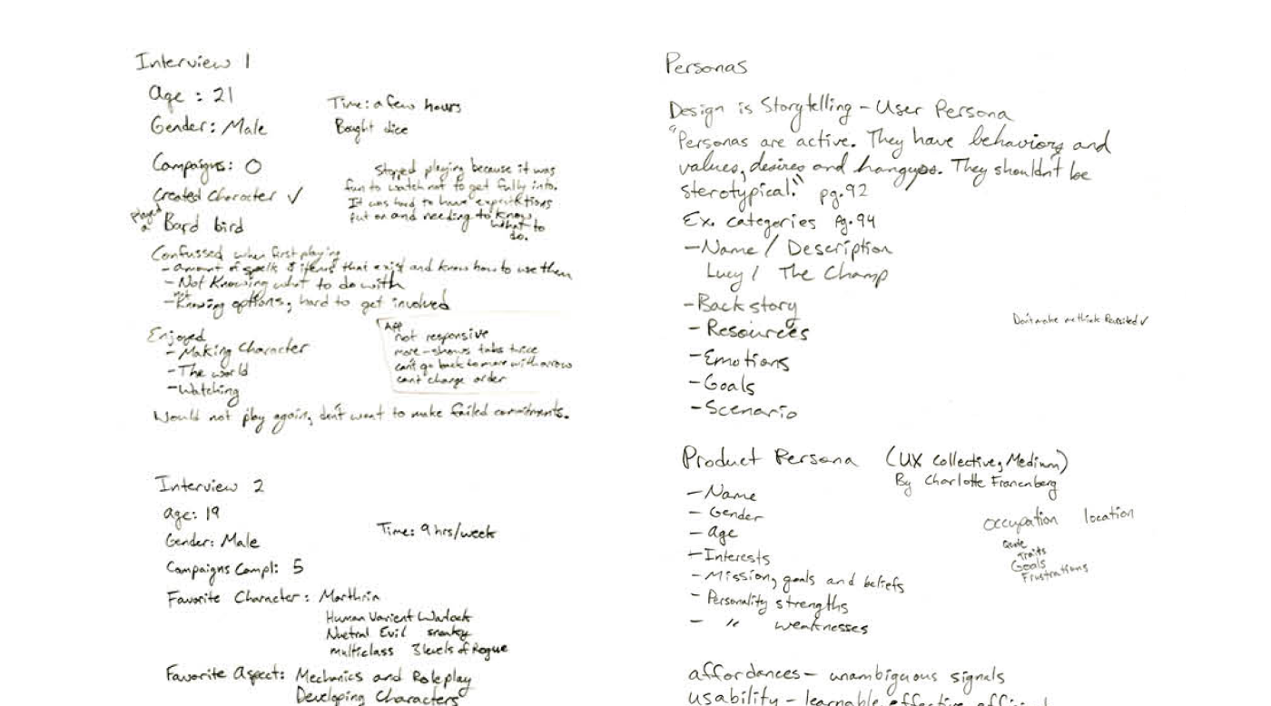
Notes from Interview Process
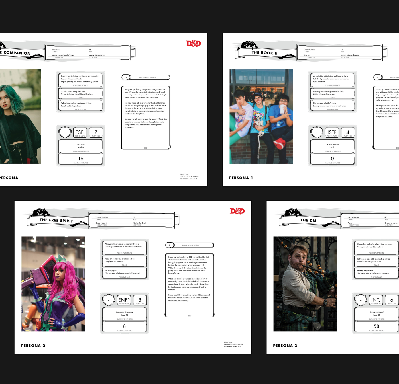
I then conducted some initial user interviews with both new and seasoned D&D players. I created three user personas based off the types of people I interviewed. They generally fell into one of three categories, the novice/beginner type, the intermediate in-it-for-fun type, and the serious all-in type. In addition to these user personas, I also created a product persona that helped me understand how the product would interact with the users. These personas guided the rest of the design process and ensured I was designing for actual users and real problems.
Using what I learned about the D&D franchise and the players, I designed a fresh identity for the app to breath some life into it.
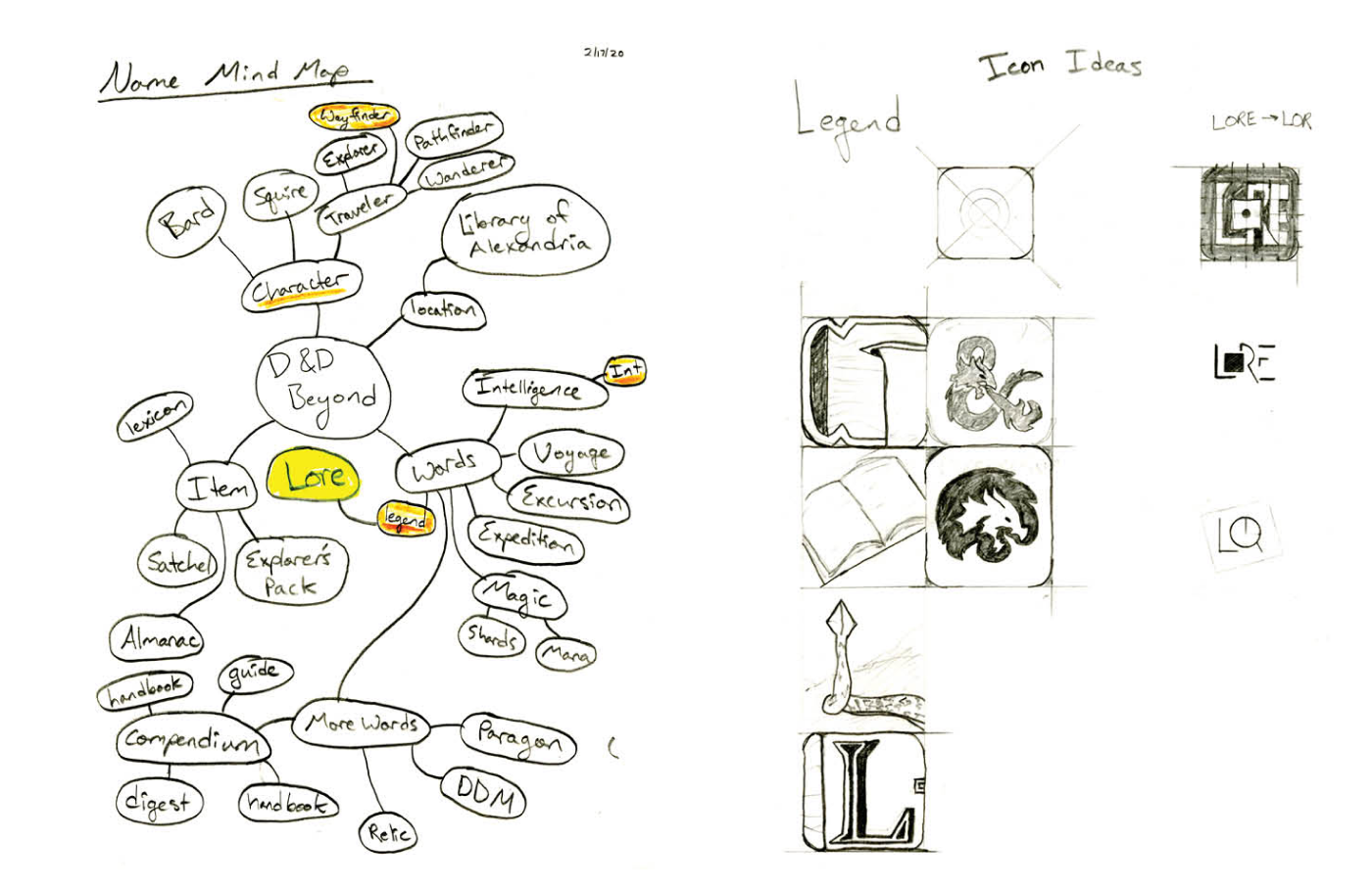
Brand Sketches
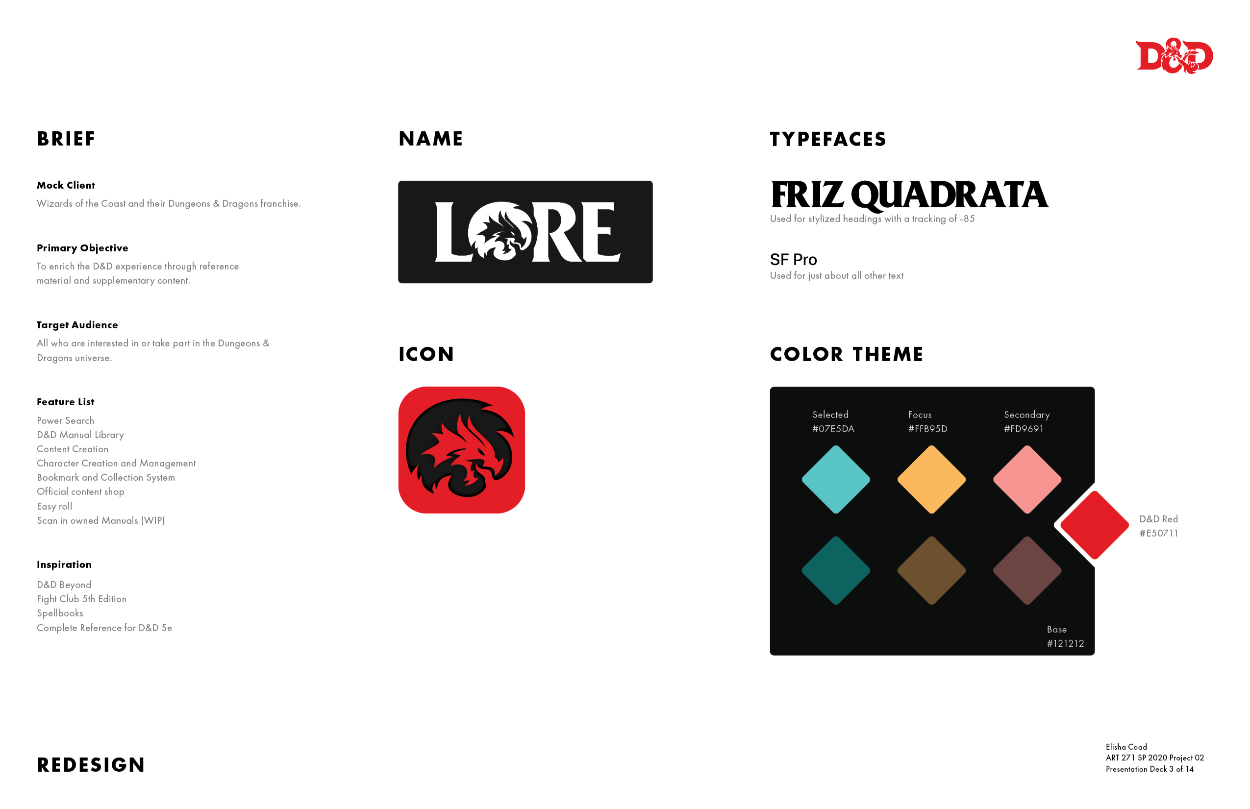
Brand Spec Page
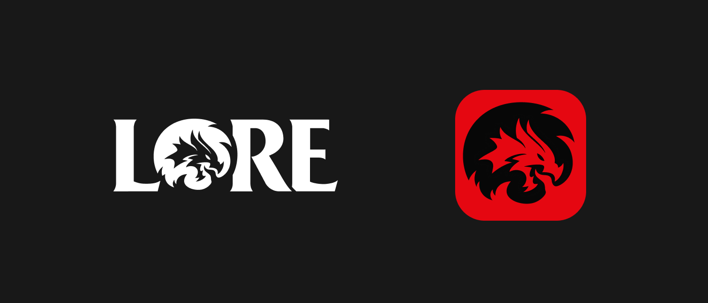
In this redesign, I wanted to pay homage to the roots of D&D while still allowing the app to take on a personality of its own. The name and icon incorporate key features from the D&D logo and are then further customized to create a distinct identity. I chose Friz Quadrata as the primary typeface as it has an excellent nostalgic factor due to its use in classic D&D content. These elements all come together to create a brand that is both novel yet familiar.
I built out the UI with a dark theme as it fit the D&D aesthetic. The interface was all built using Google's Material Design standards including their guidelines for dark themes. This provided a solid base structure from which to expand.
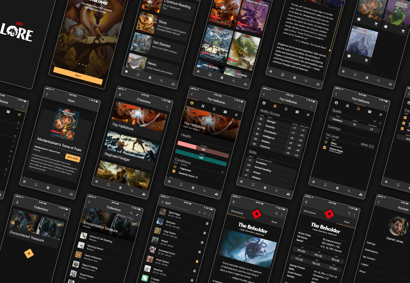
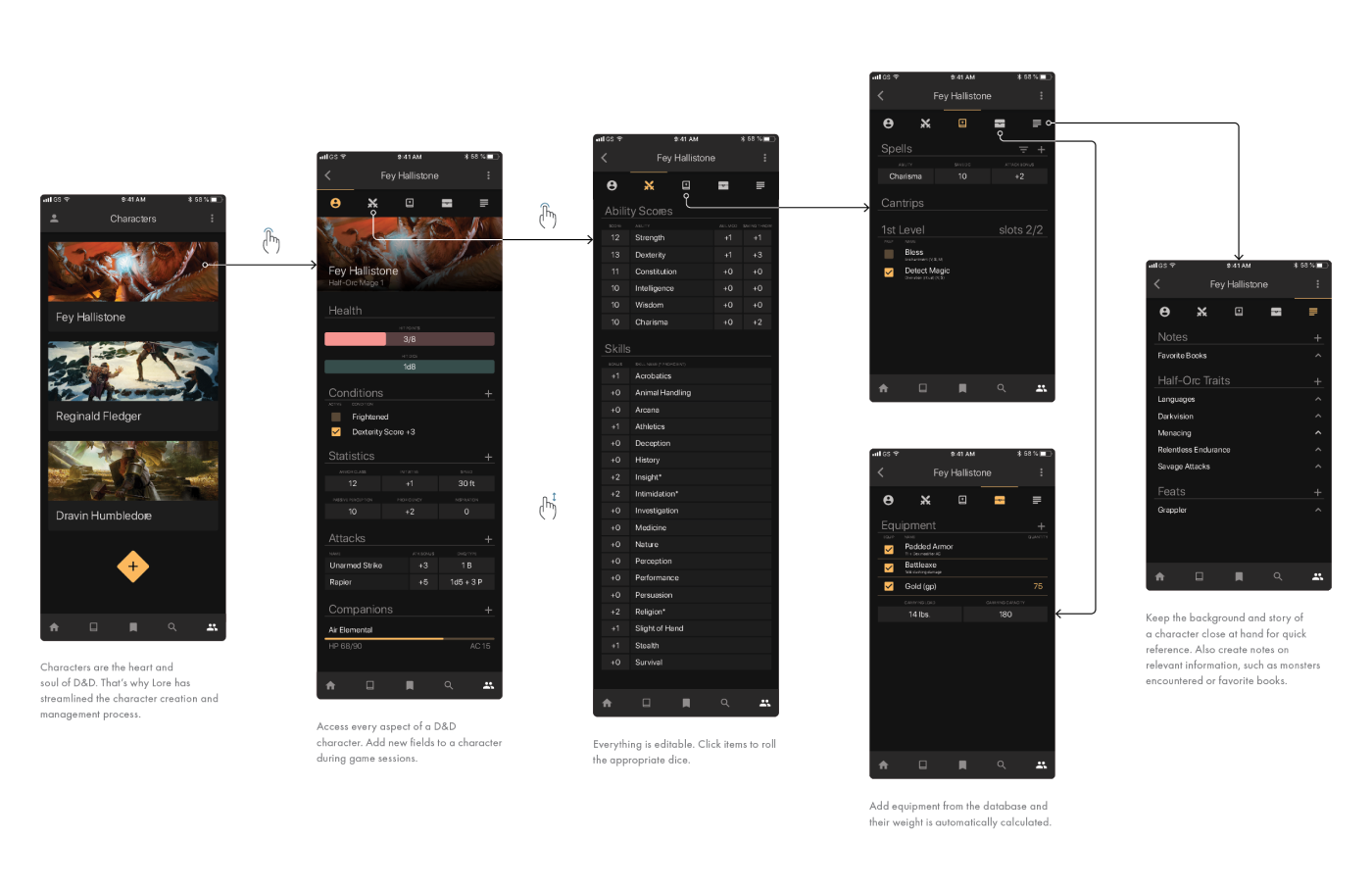
After designing the UI and prototyping it, I did some user testing interviews to hear feedback from D&D players. I incorporated their feedback and then created thorough documentation of the app highlighting the flows and interactions. This would make it easy to handoff to developers.
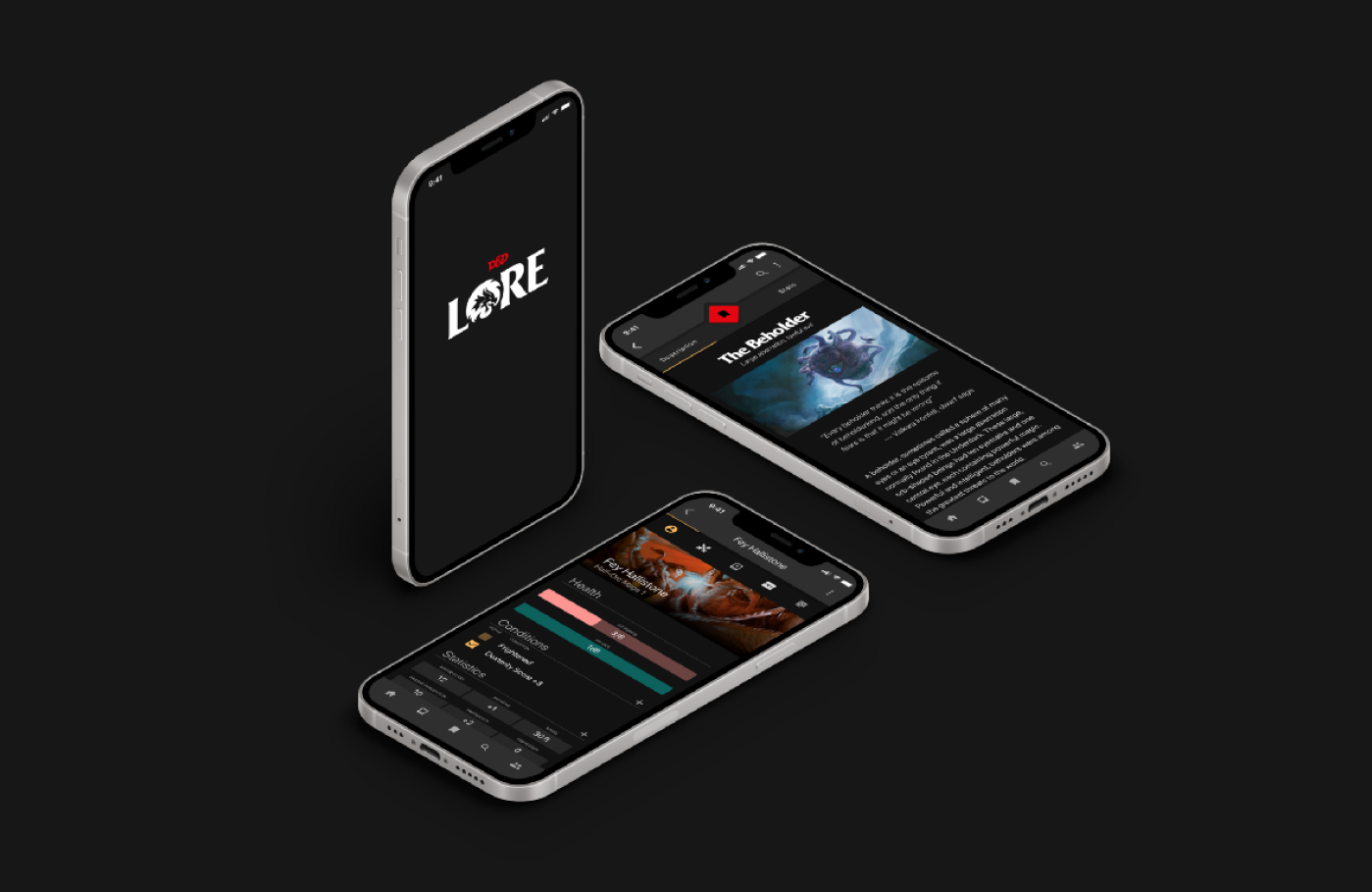
At the end, I completed a new D&D sub-brand for the app, a revised UI, and interviews with D&D players along the way to validate the project.
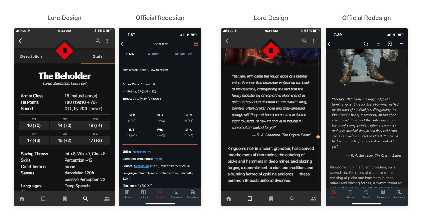
My designs compared to the official rebrand.
While done as an experimental project, I learned a lot through the process. It was fun to dig into something that I enjoyed and to better understand other players in the hobby. It's also funny because a couple years after I created my redesign, the D&D company released an official redesign of their own, which surprisingly had a lot of similarities to my redesign. Not only was it dark themed, but several of the screens and features mirrored what I added in this Lore project. While who knows if they saw my work, it is cool to see that I wasn't too far off the mark.