John Deere
Led a design system overhaul that unified a fragmented ecosystem and improved efficiency across the organization.
Design Systems
Foundations
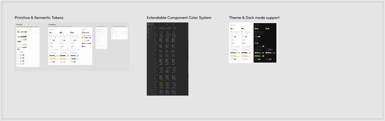
Scattered files, Sketch libraries that never quite matched, and components that got rebuilt differently in every file. That's what the design system looked like at John Deere before this project. I led the transition to a token-driven system built from the ground up in Figma, easy to consume consistently by both design and engineering.
Primitives before opinions
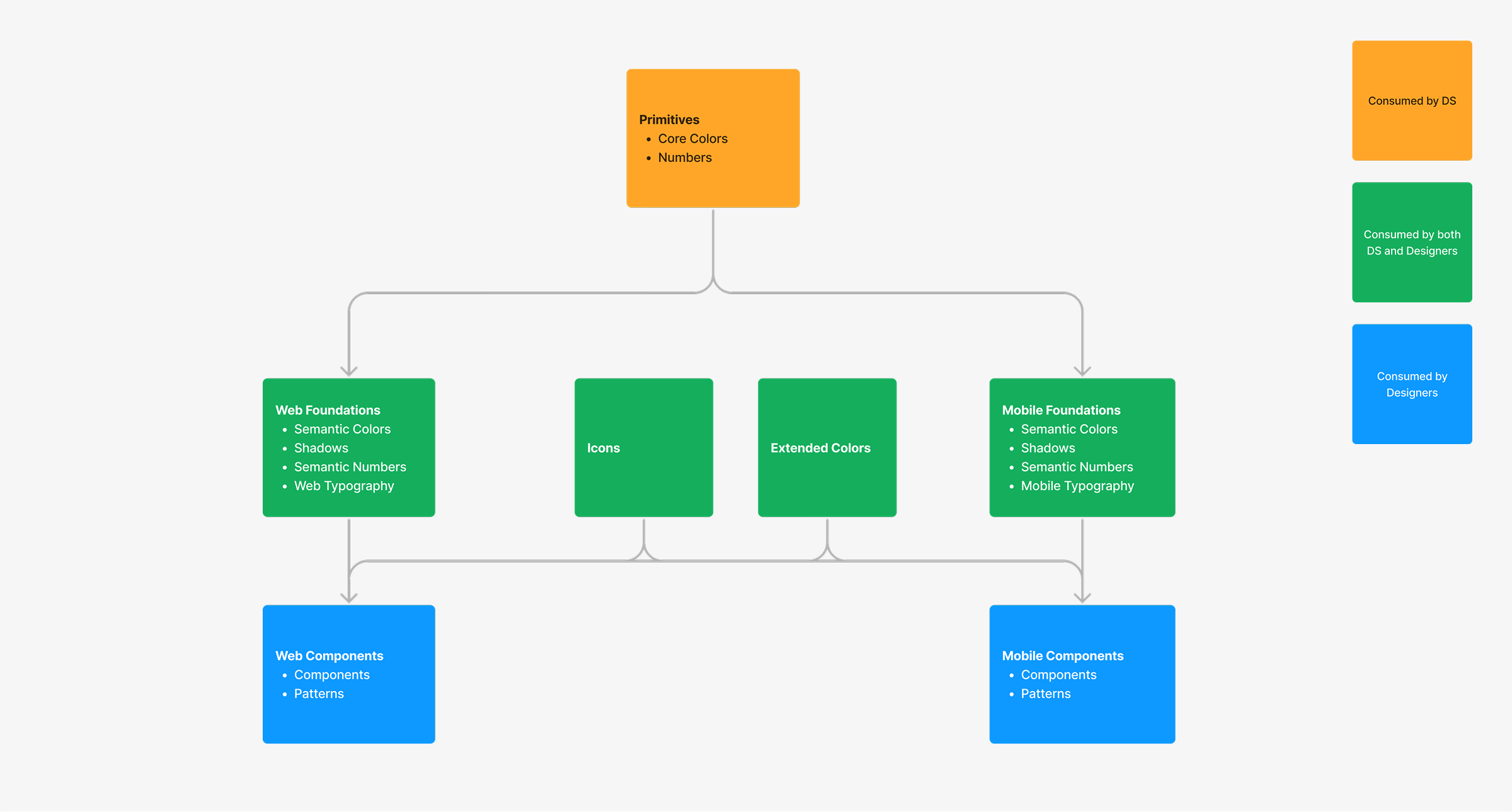
Everything starts in the primitives layer, raw color and number ramps with no meaning attached yet. Foundations sit on top and add semantics: "text-primary" instead of "gray-900", spacing pulled from an 8px grid. Components reference foundations, never primitives directly. That rule helps stop three teams from quietly using three different grays for the same application.
Making optional layers on purpose
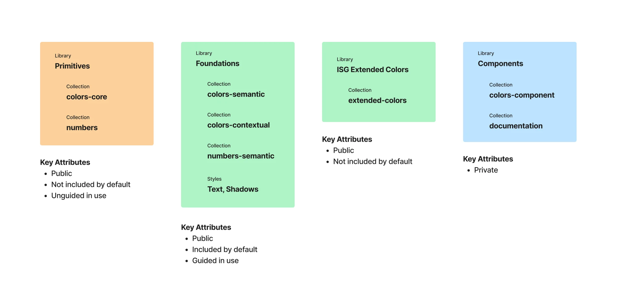
Not every team needs every color. Machine-state colors and field boundary colors, for example, only mattered to a handful of product teams working on equipment monitoring. I split those into an extended-colors collection that teams could opt into per file, instead of bloating the foundations library everyone was using. It's a small decision, but it makes sure you're only looking through 12 colors you use rather than 50 you don't.
Dark mode as a byproduct, not a project
Because every component referenced semantic tokens instead of hardcoded values, dark mode support came from swapping one variable collection for another. This meant we no longer had an entirely separate dark-mode Sketch page to keep in sync. That was the real payoff of the token work; it turned what used to be a multi-week initiative into a mode switch.
Components
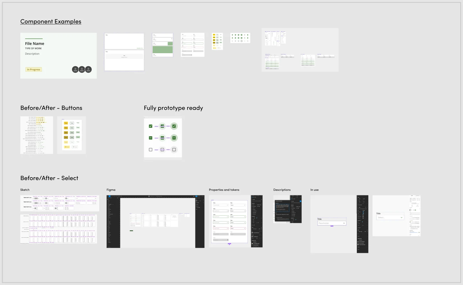
With the token foundation in place, I rebuilt the component library itself. Cards, text fields, buttons, checkboxes; each one fully documented and, unlike the Sketch symbols they replaced, actually prototype-ready.
A step-by-step definition of done
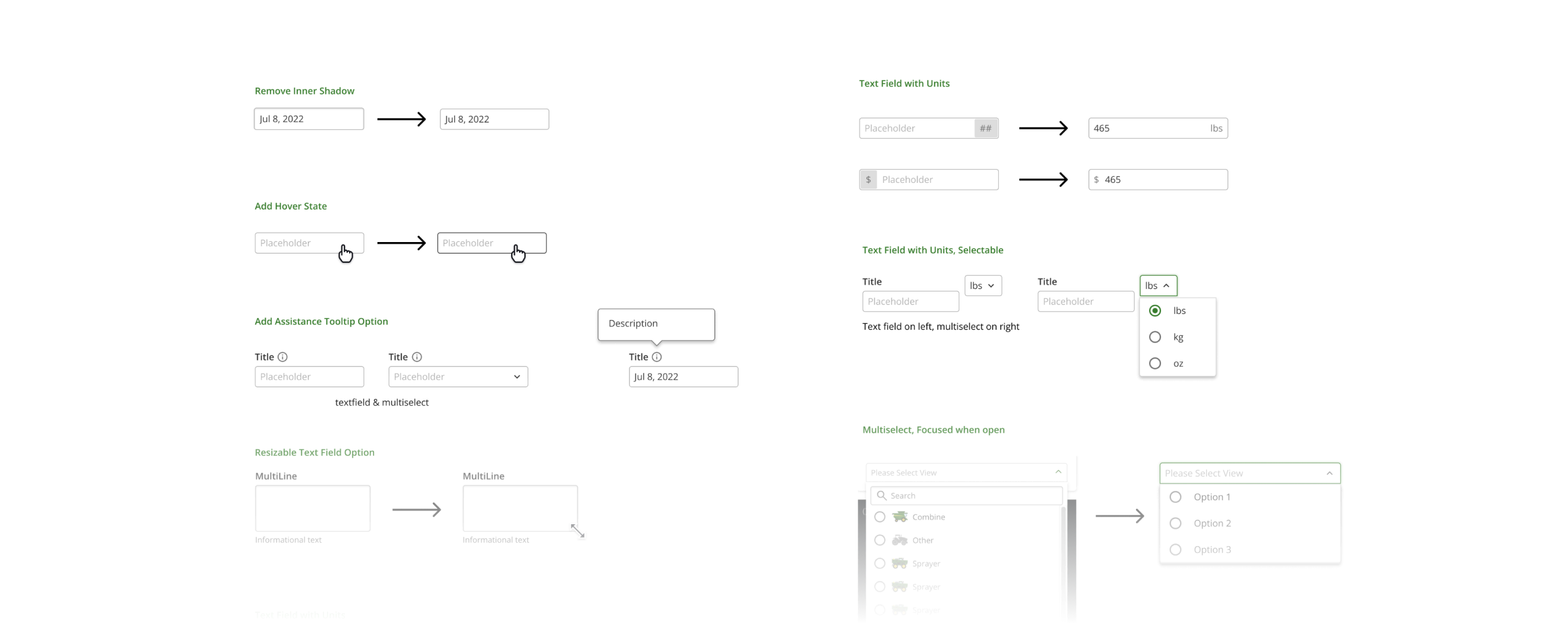
Every component went through the same pipeline: audit the Sketch and live code for existing patterns, build it in Figma with real variants, wire up properties and tokens, write the usage description, then verify it in an actual product file before calling it shipped. Skipping the last step was how the old system ended up with components that looked right in the library but were misaligned in application.
Interaction states weren't an afterthought
Every component shipped with every state: hover, pressed, focused, disabled, loading. Built with real Figma interactive components. Designers could drop a component onto the canvas and then prototype the flow with minimal work.
Adoption
A design system nobody adopts is worthless. Migrating an entire org off Sketch meant the hard part wasn't the Figma file; it was getting designers who'd built muscle memory over years to trust a new tool and a new set of rules.
Feedback as a standing feature, not a survey
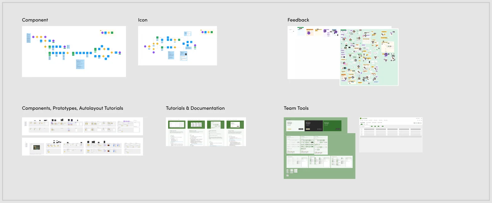
I ran an open FigJam board where any designer or engineer could leave feedback regarding a specific component or token. That helped round out the rough edges: naming that didn't match how designers actually thought about a component, a token that was technically correct but confusing to reach for. Small fixes, but the kind that compound into whether people trust the system enough and whether it's actually enjoyable to use.
More than just a system
A design systems team is more than just the system; it's about equipping the product team with the tools they need to build as smoothly as possible. After fielding the same autolayout and component-usage questions repeatedly, I built tutorials and reference docs designers could self-serve from. I also led tutorial sessions on Figma to help the team better transition and take advantage of all Figma has to offer. This freed up the time I would've spent on one-off Slack threads to focus on the questions and parts of the system that needed my attention.
Impact
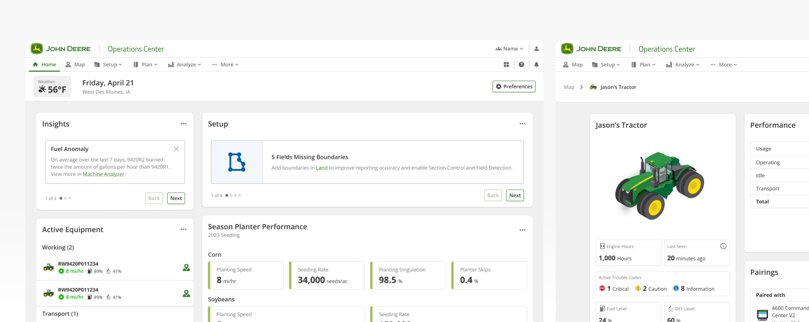
The real test of a design system isn't the library file; it's whether it shows up in what ships. Here are live screens from John Deere's Operations Center, built on the token and component work above.
What actually changed
Before this, three teams would each build and ship their own version of an accordion that looked and behaved differently. After, there's one accordion, one set of tokens behind it, and one place to fix it when something needs to change. For every team, on every platform, in multiple themes.